Monday, June 06, 2016
2-D or not 3-D?
Clearly I haven't posted much on my art lately. I have been thinking about it a bunch but haven't picked up a brush recently -- except to paint the walls in the new Brooklyn apartment. Before I left NC I worked on a few 3D pieces using wood, gourds, and metal. Oh and the odd one made from a broken Rob Levin glass bowl.
Tuesday, April 26, 2016
Finalized version of my personal website: chrisbeacham.com
I recently created chrisbeacham.com that describes my work in arts-driven economic development including some interesting materials on some of the projects I've led.
It also includes various blog posts on topics of interest like the Met Breuer opening and a new report on my fascination with Martin Wong.
Check it out and let me know what you think.
| Rob Levin & other glass artists working at Penland School of Crafts |
Check it out and let me know what you think.
Monday, April 04, 2016
The new Met Museum for Contemporary Arts: A review of the initial exhibit
The Metropolitan Museum of Art Breuer is open
Recap: Whitney moves to Chelsea, Met buys Whitney Breuer building, remodels & creates modern & contemporary art venue, opens with a somewhat unusual show plus a dynamic exhibition of a lesser known but brilliant Egyptian artist. An unschooled writer compares the Unfinished show to baseball and spring training.

- Elizabeth Peyton's Napoleon as modern rock star
I start here with the Unfinished exhibit and add something on the terrific Nasreen Mohamedi in a later post. So, Unfinished has gotten universally meh reviews. I've linked to some of the reviews at the end here, but basically for the critics it is a swing and a miss. Some say "a wild, swinging strikeout", others call it "a weak dribbler to first" while some admit that, while not pretty, "a broken bat single is still a hit." Heads up: I'm glass more than half full and I highly recommend a visit. The bad misses are more than made up for by wonderful and very fun doubles off the wall followed by a homer or two.
I loved it while still understanding the complaints. The curators stretch the concept, meander, throw some wild pitches, and generally play a bit sloppy. Mixed metaphors and rookie mistakes abound (sounds like this review). Still, it's mostly an ungainly rookie who'll make it in a couple of years. Think Nuke LaLoosh tied to the bed listening to Annie read Walt Whitman and then reaching the bigs later and winning a Cy or two.
I mean how can you hate seeing the amazing Alice Neel portrait you see top left? It's a great and melancholy story but James Hunter Black Draftee is a brilliant piece and really a perfect encapsulation of the conceit of the show. It basically answers the question "Is unfinished really a bad thing?" with a resounding "No!" Who decides anyway? In this case the US government, the draft, serendipity, and Alice did. Grand slam to right!
Without going into too much detail and analysis let's look at a few and see if they make a visit seem worth it:
The Rembrandt to the right reflects a beautiful casualness. Perfection is not the goal but emotion might be. The luminous knife and stunning facial richness makes this piece for me. Is it unfinished? Hard to tell. Triple off the wall for van Rijn!
How about this rad Lucien Freud? Double down the line scores two!
Kerry James Marshall rips a solid single up the middle.
Rauschenberg's creatively titled White Painting? Strikeout on a 3-2 pitch in the dirt with the bases loaded in the bottom of the ninth. Admittedly the shadow of the woman walking by and ignoring it does help.
Anyway, go see Unfinished with an open mind and a bag of Cracker Jacks.
Other artists featured: Pollock, Twombly, Marden, Mondrian, Newman, Johns, Lewitt, de Kooning, Picasso, Degas, Cezanne, Renoir, Van Gogh, Warhol, Titian, Turner, Bourgeois, Manet, Monet, Giacometti.
Other, more erudite and less obsessed with spring training reviews.
Hyperallergic:
NYT, first Roberta Smith and then Holland Cotter:
- Elizabeth Peyton's Napoleon as modern rock star


Wednesday, March 23, 2016
The new ChrisBeachamPaints and ChrisBeacham websites
I've moved my old Sandvox based site over to Wordpress (Twenty Fourteen theme) and I like it. It took a while but I think it's cleaner and more attractive. Go to chrisbeachampaints.com and let me know what you think.
I've also established chrisbeacham.com as my personal site that I'm using to sell myself after moving to Brooklyn without a job. It's also Wordpress using the Portfolio theme Ditto on letting me know what you think.
Friday, January 08, 2016
You never can tell
So Karen and I have given away most of our work because we had no place to keep it. It's gone to family, friends, workmates and acquaintances. This one I posted about in 2013 (see below). My older son liked it so he took it. But before he did he rotated it counterclockwise and made it into an abstract landscape (if that makes sense). Certainly is more interesting. If you own any of my paintings feel free to turn them any way you want!
In Brooklyn & about back to painting!
There's been no art making for a long time. Art thinking, yes, but no art making. Many reasons but the best excuse is no good studio access.
Those days are over -- we move into the new place in Park Slope, Brooklyn tomorrow. We won't have a big studio but it'll be good enough with good light. Hopefully I'll be able to post a new thing or two soon.
Now to find a job....but before that two more B&W (or sort of) that I haven't posted.
Those days are over -- we move into the new place in Park Slope, Brooklyn tomorrow. We won't have a big studio but it'll be good enough with good light. Hopefully I'll be able to post a new thing or two soon.
Now to find a job....but before that two more B&W (or sort of) that I haven't posted.
Sunday, June 07, 2015
Earlier black and white pieces
I've posted some of the black and white pieces that I've been doing with graphite powder. I was actually doing some B&W before that, just in a different format and medium. So here are a couple of them.
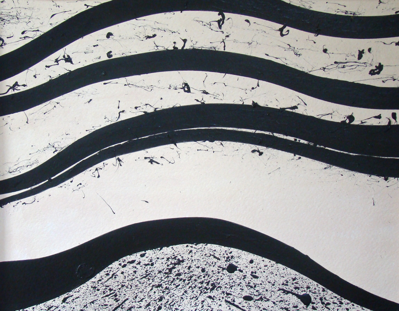
This is black acrylic and white ink on plywood. I'm not sure why I started doing these pieces but I did a number of them.
This one is similar though not as successful I think.
And here's one more on paper. All acrylic I think.
![]() |
| 24 x 28 Untitled |
![]() |
| 24 x 24 Untitled |
This one is similar though not as successful I think.
![]() |
| 11 x 15 |
And here's one more on paper. All acrylic I think.
Saturday, May 30, 2015
More the black and white (mostly) things I've been working on...
These generally all begin with watercolor paper. I rub wax (just on old candle) on the paper where I don't want the graphite powder to adhere. Then I rub the powder on the paper, lots sometimes, less other times. The powder really sticks to the wax (you'll see very black there), but how much powder sticks to the raw paper varies. Next step: spray fixative on the piece -- usually a couple of times. Then I start using various tools to scrape away wax leaving the white paper showing. That's pretty much it in a nut shell.
Sometimes they work, sometimes they don't. Maybe they're just boring, other times hopeless. I've been working with some of the those that are bit boring and cutting them in ways. I think I'll start trying to also cut and rearrange, collage, whatevah -- basically mixed media.
Here are a few examples:
This one of the left has one variation. I have cherry stain powder used in woodworking (I used to make furniture). I'll spread a bit of the stain powder and add a bit of water. It creates various shades of color as you see on the left.
I've also put it on a white background. I'm not sure which works better.
Lastly, the one below just follows the basic formula I described above.
Sometimes they work, sometimes they don't. Maybe they're just boring, other times hopeless. I've been working with some of the those that are bit boring and cutting them in ways. I think I'll start trying to also cut and rearrange, collage, whatevah -- basically mixed media.
Here are a few examples:
![]() |
| 15 x 22. Cut and backed with black paper |
![]() |
| 14 x 17. Cut and backed with white paper |
![]() | |
|
This one of the left has one variation. I have cherry stain powder used in woodworking (I used to make furniture). I'll spread a bit of the stain powder and add a bit of water. It creates various shades of color as you see on the left.
I've also put it on a white background. I'm not sure which works better.
Lastly, the one below just follows the basic formula I described above.
![]() |
| 14 x 17 |
Saturday, May 23, 2015
On Really Seeing Art
I awoke this morning with a hangover from the morose, depressing experience from last night that I described on Facebook. So I decided to do something about it. First, I listened to some Bob Marley. Pulled out some of my old art from when I first started painting. Sat on my little second floor downtown apartment deck with coffee and the latest issue of Art in America. Thought about what I might do art wise. (Definitely not that!) So I decided on a visit to the excellent and free NC Museum of Art a short drive from my place.
Most of us have a tendency, I think, to visit museums like they are all you can eat buffets. You know, there is all this food and you've got to have some of everything or you'll feel cheated. At a museum we don't want to miss something really good -- especially if you think you won't be able to return. So you're worried that you'll come home from your trip to London where you visited the Tate and somebody will ask if you saw Monet's Water Lilies and you'll have to say "No" and then they'll spend 10 minutes telling you all about it.
But when you do that everything becomes a blur or maybe, like when Karen and I visited the new Whitney last week, you walk away overwhelmed and drained. (The new Whitney is amazing.) So this time I figured I'd spend more time with fewer pieces. I immediately went to the far northwest corner of the museum. I glanced around and saw Andrew Wyeth's Winter. It is amazing and has the added advantage of being placed near a bench where I could sit, contemplate and write in my little Moleskine.
It was painted in 1946, tempera on board, right after his father's death. What makes this piece so special? It could be the boy appearing to flee down Wyeth's famous hill, his weight and the tragedy dragging him. Or the beautiful and imposing hill itself. The brushwork with the subtle changes in color and texture that creates both a sense of space and claustrophobia. The shadow too, that follows the boy down the hill adding to the force of his sadness. It is an immensely sad and perfect painting, a simple image
that tells a story that could fill a book.
Nearby is a Jacob Lawrence called Forward from 1967. It is a great companion to the Wyeth. Here it is Harriet Tubman pushing the escaping slaves forward to freedom, playing the role of the hill in Winter.
She is shoving the man forward, a revolver in hand. He's enormous, strong, and terrified, hiding his facing with his immense hand. The colors are bold and the shapes blocky without the detail of the Wyeth. To me the man is the compelling figure, the lines of his ribs, the splayed hands themselves viscerally showing both his physical strength and his terror.
This vision of humanity, of fear, of tragedy, of strength, of heroism, of courage, of determination, of fearlessness both breaks my heart and gives me hope.
Here the forward motion is provided by lonely Joseph, staff in hand, his arm around Mary. We see Mary, her face shrouded, a shawl around her head. She holds Jesus, the child's head merely a shape but lighter and with a halo.
The donkey, his head nearly dragging the ground, appears gaunt and deadly tired, stumbling down the path, his massive ears just more weight to carry.
Joseph is held up by his staff, Mary by Joseph, Jesus by Mary, and the donkey by force of will and necessity. Joseph's face looks obscured but on closer examination quite detailed, his nose, his beard, and the holes of his eyes amazingly evocative. Again, like the Wyeth and the Lawrence, a sad, beautiful, and contemplative composition.
I spent an hour plus with the three pieces. By doing so they became more than canvas and paint and more than beautiful works of art. They told me three stories that reflect the best and worst of humanity. Stories that made me think. Images that made me sad and feel intensely alive.
Most of us have a tendency, I think, to visit museums like they are all you can eat buffets. You know, there is all this food and you've got to have some of everything or you'll feel cheated. At a museum we don't want to miss something really good -- especially if you think you won't be able to return. So you're worried that you'll come home from your trip to London where you visited the Tate and somebody will ask if you saw Monet's Water Lilies and you'll have to say "No" and then they'll spend 10 minutes telling you all about it.
But when you do that everything becomes a blur or maybe, like when Karen and I visited the new Whitney last week, you walk away overwhelmed and drained. (The new Whitney is amazing.) So this time I figured I'd spend more time with fewer pieces. I immediately went to the far northwest corner of the museum. I glanced around and saw Andrew Wyeth's Winter. It is amazing and has the added advantage of being placed near a bench where I could sit, contemplate and write in my little Moleskine.
It was painted in 1946, tempera on board, right after his father's death. What makes this piece so special? It could be the boy appearing to flee down Wyeth's famous hill, his weight and the tragedy dragging him. Or the beautiful and imposing hill itself. The brushwork with the subtle changes in color and texture that creates both a sense of space and claustrophobia. The shadow too, that follows the boy down the hill adding to the force of his sadness. It is an immensely sad and perfect painting, a simple image
that tells a story that could fill a book.
Nearby is a Jacob Lawrence called Forward from 1967. It is a great companion to the Wyeth. Here it is Harriet Tubman pushing the escaping slaves forward to freedom, playing the role of the hill in Winter.
She is shoving the man forward, a revolver in hand. He's enormous, strong, and terrified, hiding his facing with his immense hand. The colors are bold and the shapes blocky without the detail of the Wyeth. To me the man is the compelling figure, the lines of his ribs, the splayed hands themselves viscerally showing both his physical strength and his terror.
This vision of humanity, of fear, of tragedy, of strength, of heroism, of courage, of determination, of fearlessness both breaks my heart and gives me hope.
I felt maybe there was a piece to create a triptych with the Wyeth and the Lawrence so I walked around, glancing here and there. And then I saw it, a John Singer Sergeant of the Flight from Egypt,
circa 1877-1879. It is a sparse piece, dark, and impressionistic.Here the forward motion is provided by lonely Joseph, staff in hand, his arm around Mary. We see Mary, her face shrouded, a shawl around her head. She holds Jesus, the child's head merely a shape but lighter and with a halo.
The donkey, his head nearly dragging the ground, appears gaunt and deadly tired, stumbling down the path, his massive ears just more weight to carry.
Joseph is held up by his staff, Mary by Joseph, Jesus by Mary, and the donkey by force of will and necessity. Joseph's face looks obscured but on closer examination quite detailed, his nose, his beard, and the holes of his eyes amazingly evocative. Again, like the Wyeth and the Lawrence, a sad, beautiful, and contemplative composition.
I spent an hour plus with the three pieces. By doing so they became more than canvas and paint and more than beautiful works of art. They told me three stories that reflect the best and worst of humanity. Stories that made me think. Images that made me sad and feel intensely alive.
Sunday, September 15, 2013
Except that's not how it ended up looking....
Saturday, May 04, 2013
Another Alma/Josef inspired piece
Saturday, April 20, 2013
Now with a comment....
So...the influence for this piece came from Alma Thomas and Josef Albers, the former for her painting style and the latter for his seminal investigations into how we see color.
Secondly the colors are off. The left side is actually a green hue and the right is a much richer and darker red. I'll for a better photo but so far I haven't pulled it off.
![]() |
| Untitled. Acrylics on canvas 20x28 |
Wednesday, March 27, 2013
My previous post...
Sunday, September 23, 2012
So it's only been four months
Wednesday, May 09, 2012
Two new pieces
Thursday, April 12, 2012
My interview on WCHL 1360 AM Chapel Hill
Jeri Lynn Schulke of the ArtsCenter in Carrboro asked me to join her back in March on WCOM 1360 AM on the Arts Spot, a community arts interview program of the ArtsCenter. My interview along with many others can be heard by going here.
We talked mostly about the activities of the Town of Carrboro Arts Committee that I chair but also more generally about the arts in Carrboro, Chapel Hill and the Triangle. We had a fun talk and got into some interesting issues for developing the arts within our area. You can download the interview as a mps or stream it.
The Arts Spot
Saturday and Sunday at 11:30am.
Join Tess Mangum Ocana and other hosts from the Arts Center in Carrboro, North Carolina as they sit down with musicians, actors, actresses, painters, and more from around the Triangle and around the world. The Arts Spot focuses on the cultural enrichment and enhancement of our lives that the arts
Sunday, March 04, 2012
Sales are nice!
Sometimes people ask whether something is for sale. I think the question comes from the idea of "losing" something that came from inside, that is very personal and that, perhaps, no one else will understand. I get that.
I got into painting never expecting to show anybody anything, much less find people willing to pay actual money for them. It turns out that people like some of my stuff. (I'll also note that the buying public often ignores my best work - bunch of philistines! I still love you.)
The truth is that there are only a few pieces that are so special in that internal connection sort of way that I will never sell. There is one painting that I have some regret selling but the right person bought it so it's okay.
Yesterday I sold a painting that has gone through many iterations, changes of direction, and frankly several layers of paint. I put it in an abstract show at Johnny's Gone Fishing and yesterday I got a call that someone wanted to buy it. So up to Johnny's to pick up the other pieces and sell one. Kevin Morgan bought it and he explains part of the why here. An interesting story that starts with a poem by Tao Te Ching and includes references to chaos and complexity theories (the painting is titled "Chaos" and I also have an interest in chaos theory) and mucus. Kevin is interesting.
So here it is:
I got into painting never expecting to show anybody anything, much less find people willing to pay actual money for them. It turns out that people like some of my stuff. (I'll also note that the buying public often ignores my best work - bunch of philistines! I still love you.)
The truth is that there are only a few pieces that are so special in that internal connection sort of way that I will never sell. There is one painting that I have some regret selling but the right person bought it so it's okay.
Yesterday I sold a painting that has gone through many iterations, changes of direction, and frankly several layers of paint. I put it in an abstract show at Johnny's Gone Fishing and yesterday I got a call that someone wanted to buy it. So up to Johnny's to pick up the other pieces and sell one. Kevin Morgan bought it and he explains part of the why here. An interesting story that starts with a poem by Tao Te Ching and includes references to chaos and complexity theories (the painting is titled "Chaos" and I also have an interest in chaos theory) and mucus. Kevin is interesting.
So here it is:
![]() |
| Chaos. Acrylics, ink probably some other stuff on canvas covered with cheesecloth. 24 x 18 |
Thursday, February 16, 2012
A new one
So this one is a modification of a Color Field influenced piece from a couple of years ago. It wasn't terrible, but it was also not terribly interesting. So I took a metaphorical axe to it. It became less an abstract...okay, not really an abstract but I like the colors.
It's acrylics on unprimed canvas attached to plywood (waaay more than you want to know).
![]() |
| Monsignor, acrylics on unprimed canvas, maybe 36 x 24? |
Sunday, February 05, 2012
A couple of new old things
First another one from the "finding something there" in an old failure of a painting. This one was actually pretty easy - so easy that I don't know why I didn't see it earlier. Basically most of the black you see was white before. And is not uncommon, I found some realism in an abstract. So it's 3 friends "Hanging Out."
Thoughts?
![]() | |
Number 2 was different. I started with a heavily gessoed over big (for me) canvas. Karen gave me the new Joan Mitchell biography for my b-day. Joan is one of my very favorite artists. The energy of her canvases is amazing. Oh to be that talented! So I was thinking about Joan and her use of color and composition. After a couple of hours last night - getting late - I stopped, happy with how it was going. Karen thinks it's finished. I'm not convinced- I'm not sure I see where the eye is drawn. But I have f-ed up enough paintings by not letting them soak in before continuing. I have NOT f-ed paintings because Karen told me to stop. So I'm stopping for now.
|
![]() |
| Birds in Flight, 36 x 24, acrylics on canvas |
Saturday, January 28, 2012
February show of my abstracts at Johnny's Gone Fishing
I'll hang a show in the back area of Johnny's Gone Fishing on W. Main Carrboro tomorrow, January 29th and it will be up through February. I've decided to show abstracts. Here's a new one. I pulled a failure from who knows when and saw a few glimmers of hope in it. After a couple of days of fooling with it something popped out. Finished and ready to go.
![]() |
| This is Not a Stained Glass Window. Acrylics on canvas. 24 x 30 |
Subscribe to:
Posts (Atom)